
How to Choose Your Wedding Color Palette (And Make It Feel Like You)
There's a moment in wedding planning when everything starts to click.
Not when you book the venue.
Not when you say yes to the dress.
It's when you find your colors.
Suddenly, every decision becomes easier. The florals, the stationery, the table settings, the wedding website — it all starts to come together into something cohesive, intentional, and deeply personal.
But getting there? That part can feel overwhelming.
With endless inspiration boards, trending palettes, and conflicting opinions, choosing a wedding color scheme is one of the most paralyzing decisions couples face early in the planning process.
This guide is here to change that.


Start With What You Already Love
The most common mistake couples make is starting with trends.
Trends are useful for inspiration. But your wedding palette should feel like you — not like something you saw on Pinterest in 2026.
Start here instead:
Look at your wardrobe. What colors do you actually wear?
Look at your home. What tones feel comfortable and beautiful to you?
Look at photos you love. What's the light like? Warm or cool?
If you're naturally drawn to earthy, muted tones in real life, a bold jewel-toned palette will feel jarring — no matter how beautiful it looks online.
The best wedding color palettes are extensions of a couple's existing aesthetic, not departures from it.
Let Your Venue Guide You
Before you fall in love with a palette, understand your venue.
Every space has its own undertones, textures, and existing colors — and working with them (rather than against them) makes everything feel harmonious.
Some general principles:
Warm wood tones and natural textures (barns, gardens, rustic spaces) pair beautifully with earthy palettes: sage, terracotta, ivory, burgundy.
White walls and high ceilings (ballrooms, modern spaces) are essentially blank canvases — almost any palette works, but they especially elevate clean, editorial combinations.
Outdoor and coastal venues tend to complement softer, fresher tones: dusty blue, blush, lavender, warm sand.
Historic or ornate spaces often call for rich, saturated palettes that can hold their own against elaborate architecture.
The goal is coherence. Your palette should feel like it belongs in the space — not like it's competing with it.
Choose a Color Structure, Not Just Colors
A cohesive wedding palette is built on structure, not just color selection.
Most well-designed palettes follow a simple formula:
1 dominant color + 1–2 accent colors + 1–2 neutrals
For example:
Dusty sage (dominant) + blush (accent) + ivory and warm white (neutrals)
Deep burgundy (dominant) + gold (accent) + cream and charcoal (neutrals)
Slate blue (dominant) + terracotta (accent) + linen and taupe (neutrals)
This formula keeps the palette from feeling chaotic while still allowing for depth and visual interest.
Limiting yourself to 2–4 colors total — before neutrals — is almost always the right move.
Think About Light, Not Just Color
Color doesn't exist in isolation. It changes depending on light.
A palette that looks perfect in a Pinterest image (taken in soft golden-hour light) might read completely differently in the harsh midday sun, or in the warm candlelight of an evening reception.
Before finalizing your palette:
Check your venue at the time of day your wedding will actually happen.
Look at fabric swatches or florals in that specific light — not on a screen.
Consider how artificial lighting (uplighting, candles, Edison bulbs) will shift the tones throughout the evening.
Warm lighting makes dusty, muted palettes glow. It can make cool tones look flat.
Bright, neutral lighting is more faithful to the true color — which is ideal for editorial, clean palettes.
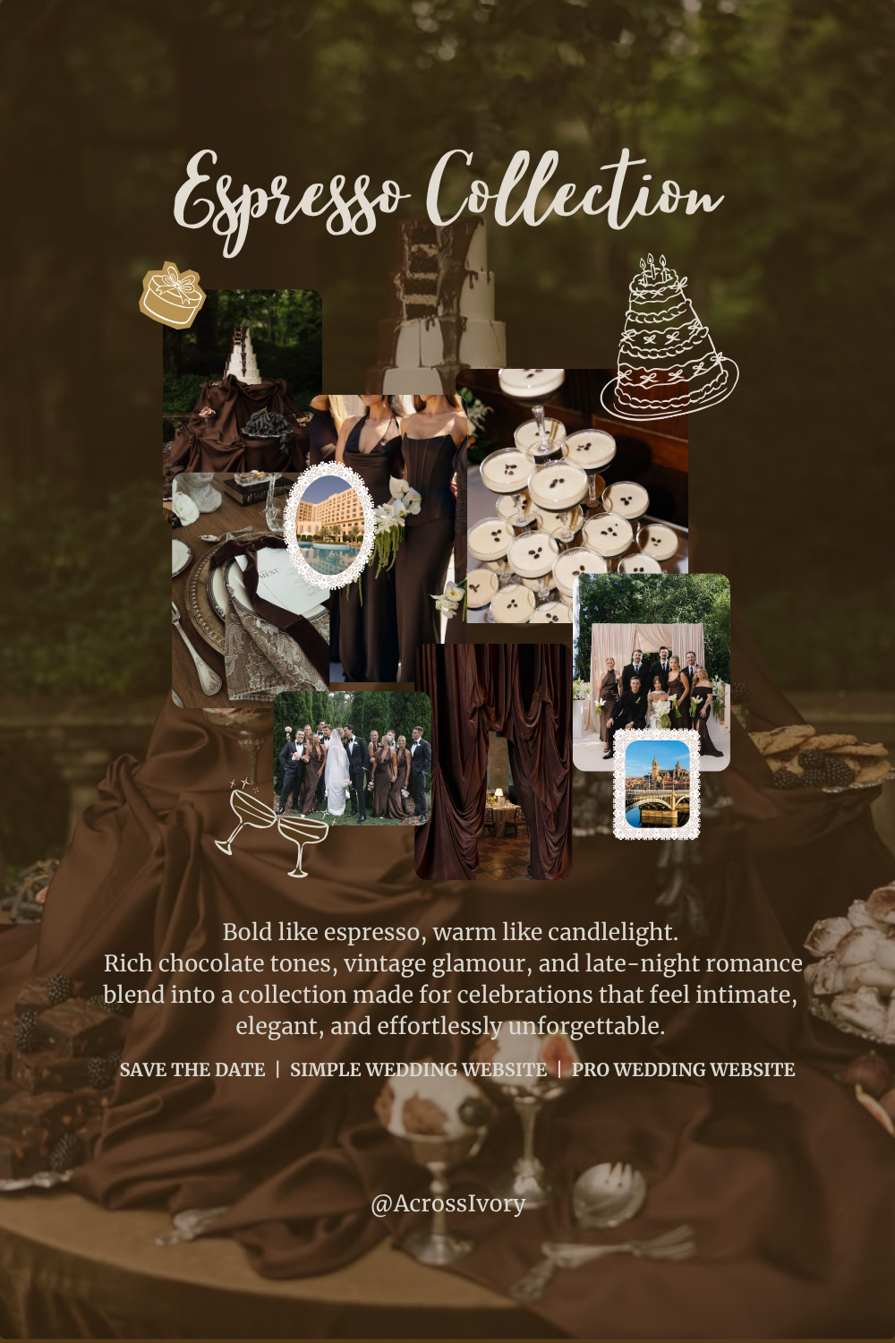
2026 Palettes Worth Knowing
If you're looking for a starting point, these are the combinations that are resonating most in 2026:
Dark and Editorial
Deep burgundy, charcoal, and ivory. Moody and sophisticated, with a cinematic quality that translates beautifully to photography.
Warm Earth Tones
Terracotta, sage, and warm cream. Organic, textured, and incredibly versatile across venues.
Dusty Romantic
Mauve, dusty rose, and soft champagne. Timeless and feminine without feeling overly traditional.
Modern Neutral
Warm taupe, ivory, and soft gold. Clean, elegant, and endlessly adaptable.
Botanical Green
Olive, deep green, and ivory with floral accents. Fresh, editorial, and unexpectedly luxurious.
None of these are rules. They're starting points.
Bring It All Together With Your Stationery and Digital Details
Once you have your palette, apply it consistently.
Your wedding color palette shouldn't just live in the florals and bridesmaid dresses. It should carry through every touchpoint of the experience:
Save the dates — the first impression guests get of your wedding aesthetic
Wedding website — where guests spend the most time before the actual day
Place cards and table details — the texture guests see up close
Rehearsal dinner invitation — setting the tone for the celebration ahead
When every element feels visually connected, the wedding stops feeling like a series of separate decisions and starts feeling like a world.
That's when a wedding becomes truly elevated.
A Note on Trends
Following trends isn't wrong.
But the couples whose weddings feel most personal — and whose photos they'll still love in ten years — are the ones who used trends as inspiration, not instruction.
The right palette isn't the most popular one of the year.
It's the one that makes you feel like yourself.
At Across Ivory, every collection is designed around a distinct color palette — crafted to feel editorial, cohesive, and timeless. Explore our collections at acrossivory.com/collections.